What Is Colour of the Year?
The selection of the Pantone Colour of the Year, the global authority on colour, has for years been one of the most anticipated announcements in the world of design, fashion and marketing. Each year, after careful analysis of trends around the world, from culture to art to social events, Pantone announces the colour that they predict will reflect the spirit of the coming year. This is not just a trend prediction, but a declaration that influences product development and marketing strategies in various industries around the world. No wonder so many people have been waiting for the announcement of what the colour of the year 2024 is.
Pantone color of the year selection process is the result of meticulous analysis and research involving colour experts from around the world. They take into account a wide range of factors, including popular travel destinations, new technologies, materials, textures and even socio-economic conditions that can alter public sentiment and attitudes. This comprehensive approach allows Pantone to identify a colour that not only dominates trends, but also resonates with current moods.
According to research, colour influences 85% of purchasing decisions.
The importance of choosing the Pantone color of the year goes far beyond its aesthetic dimension. For designers, the Pantone colour of the year represents a source of inspiration and creative challenge. For marketers, the colour of the year represents a tool that can be used to capture consumer attention, reinforce the brand and communicate value. In the fashion industry, the impact of the colour of the year is apparent almost immediately, with designers and brands quickly incorporating it into their collections, often leading to increased sales and media attention.


Statistics and research show that introducing the colour of the year into a product offering can significantly influence brand perception and consumer purchasing decisions. According to research, colour influences 85% of purchase decisions, highlighting its importance in marketing strategies.
Pantone's choice of colour of the year is not only an expression of artistic vision, but also a strategic tool that shapes the creative industries and consumer markets.
Latest colours
Colour of the Year 2021 - Ultimate Gray and Illuminating
For 2021, Pantone made an unusual decision by choosing two colours: Ultimate Gray (17-5104) and Illuminating (13-0647). This combination of grey and bright yellow symbolised strength and positivity, offering comfort and hope in times of uncertainty. Ultimate Gray represented the solidity and reliability of solid foundations, which are essential in difficult times, while Illuminating, a bright and cheerful yellow, reflected a desire for optimism and better days. The influence of these colours was evident in fashion, where designers incorporated these colours into their collections as a symbol of strength and hope. In interior design, the combination brought light and positivity to living spaces, while in graphics and packaging, products gained appeal from their freshness.


Colour of the Year 2022 - Very Peri
In 2022, Pantone introduced an entirely new shade, Very Peri (17-3938), which combined the calm blue with the vibrant energy of red. Very Peri symbolised transition and the discovery of new perspectives, reflecting how the digital world and physical experiences are becoming increasingly integrated. In fashion, Very Peri appeared in collections as a bold but versatile colour that added depth and visual complexity. In interior design, the shade brought a sense of innovation and dynamism, highlighting creativity and originality. In the graphic design and marketing industry, Very Peri has gained recognition for its ability to attract attention.

Colour of the Year 2023 - Viva Magenta
The colour of the year for 2023, Viva Magenta (18-1750), is a vibrant and energetic shade that exudes strength and confidence. Growing out of red, but much more complex, Viva Magenta celebrates the spirit of rebellion and optimism. In fashion, this bold colour has been received with enthusiasm, adding character and depth to clothing and accessories. In interior design, Viva Magenta brought vibrancy and dynamism, creating spaces full of life and energy. In marketing and brandinug, this colour attracted attention as a symbol of strength, courage and positive transformation.

Each of these colours, representing 2021-2023, reflected unique qualities and emotions, inspiring industries to explore new possibilities and express the universal aspirations of humanity. From optimism and strength to innovation and rebellion.
What Is the Pantone Colour of the Year 2024?
Pantone's colour of the year for 2024 is Peach Fuzz (13-1023). This unique peach shade, infused with warm, soft tones, brought with it the promise of renewal and an optimistic view of the future.

"Peach Fuzz" exudes a subtle sweetness and softness, reminiscent of the first rays of sunshine in the morning or the softness of a pale peach. Its visual description evokes images of tranquillity, warmth and comfort, creating a space in which to find solace and peace. The emotions and associations associated with this colour are deeply rooted in a sense of hope and positivity, encouraging moments of reflection and appreciation of the simplicity of everyday moments.
Pantone's choice of 'Peach Fuzz' as the colour of the year 2024 is no coincidence. As society strives for balance and authenticity, this peach shade symbolises the human desire for warmth, kindness and greater harmony in human relationships. It reflects the current public mood, which leans towards a more balanced and conscious approach to life, promoting values such as caring, compassion and mutual support.

The influence of 'Peach Fuzz' on creative industries and trends cannot be overstated. In interior design, the colour introduces an atmosphere of warmth and cosiness, making it more inviting and relaxing. In fashion, the shade has inspired designers to experiment with colour palettes that speak to individuality and sophistication. In graphics and branding, 'Peach Fuzz' has become a symbol of innovation and a fresh approach, helping brands to stand out and establish a deeper emotional connection with their audiences.
How To Use the Pantone Color of the Year?
Introducing the colour of the year 2024, 'Peach Fuzz', into various aspects of daily and professional life can bring refreshing changes and new energy. Its warm, delicate shade offers many possibilities for use, from fashionable wardrobe accents to subtle details in interior design. Here are some practical tips and inspiration on how this delightful colour can be used in a variety of industries.
In Interior Design
Colour Accents
Introduce 'Peach Fuzz' into your home with colour accents such as cushions, curtains or carpets. This colour will bring a sense of warmth and optimism to the space.
Walls
Painting one of the walls in 'Peach Fuzz' can completely transform the look of a room, making it more welcoming and inviting.

Furniture
Refreshing the furniture, with new upholstery in the shade "Peach Fuzz" will not only transform its appearance, but also add a modern touch to the interior.

In Fashion
Everyday Styling
Incorporating the peach colour into your everyday wardrobe with accessories such as bags, scarves or jewellery is a great idea. This will give even the simplest styling a fresh look.

Occasional Outfits
When choosing occasional creations, look out for dresses and suits in the shade 'Peach Fuzz'. This colour is perfect for spring and summer celebrations, adding elegance and lightness.

In Design and Branding
Marketing Materials
"Peach Fuzz" will look great in graphic designs such as posters, business cards or packaging. This colour will attract attention while communicating the modernity and originality of the brand.
Websites and Social Media
Introducing elements in the colour 'Peach Fuzz' to websites and social media profiles can be a good step. It will make them seem more welcoming and memorable to the audience.
In Art and Decoration
Artistic Creation
"Peach Fuzz" will work well in both abstract compositions and more realistic works.
Decoration and Arrangement
When planning decorations for special occasions such as weddings or birthdays, use the peach colour to create a warm and inviting atmosphere.

In Photography
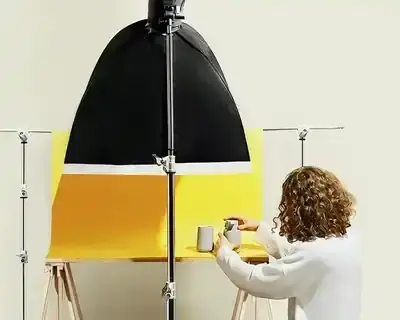
In photography, 'Peach Fuzz' opens up new horizons for artists and photographers, giving them the opportunity to explore warm, subtle tones in their work. This particular peach shade can be used to create soft, ethereal backgrounds that emphasise the softness and emotional depth of the subjects being portrayed. Photographers can experiment with natural light to highlight the subtle nuances of 'Peach Fuzz', creating images that exude calm and positive energy. In fashion photography, this colour can add a lightness and freshness to styles, especially in outdoor shoots, where the natural surroundings combined with the 'Peach Fuzz' create a harmonious and memorable composition. Additionally, in product photography, the use of 'Peach Fuzz' as a background or accent can make a product stand out, making it more appealing to an audience looking for warmth and softness in everyday objects.

What Is the Value of the Colour of the Year?
The colour of the year 2024, 'Peach Fuzz', announced by Pantone, represents a significant turning point for a variety of sectors - from fashion and interior design, to graphics and branding, to photography and art. Its selection highlights not only the aesthetic preferences for the coming year, but also reflects the deeper social and emotional trends that shape our approach to life and work.
Looking for a professional photographer to take better product photography?
Choose marszalstudio photographers!
Rethinking the impact of 'Peach Fuzz' on future trends and innovations in design and fashion focuses on the possibilities this colour opens up. We can expect that its introduction into the mainstream will contribute to a greater interest in colour palettes that promote wellbeing, calm and positivity. "Peach Fuzz" may also inspire designers to explore new materials, techniques and concepts that reflect these values, contributing to the development of a more sustainable and conscious approach in the industry.
"Peach Fuzz", has the potential to influence a wide range of sectors, promoting values such as warmth, optimism and authenticity. Its impact on future trends and innovation is likely to be evident in the way we perceive colour and its use in our environment, which could open up new opportunities for creative expression and design.


