Product photography examples are only useful if they show why a photo sells: the buyer sees the material, the colour and the size without touching the product. Below are 40 photos from 8 industries, all from our own product photography shoots. For each one: what works, where to use it and how to order a shoot like it.
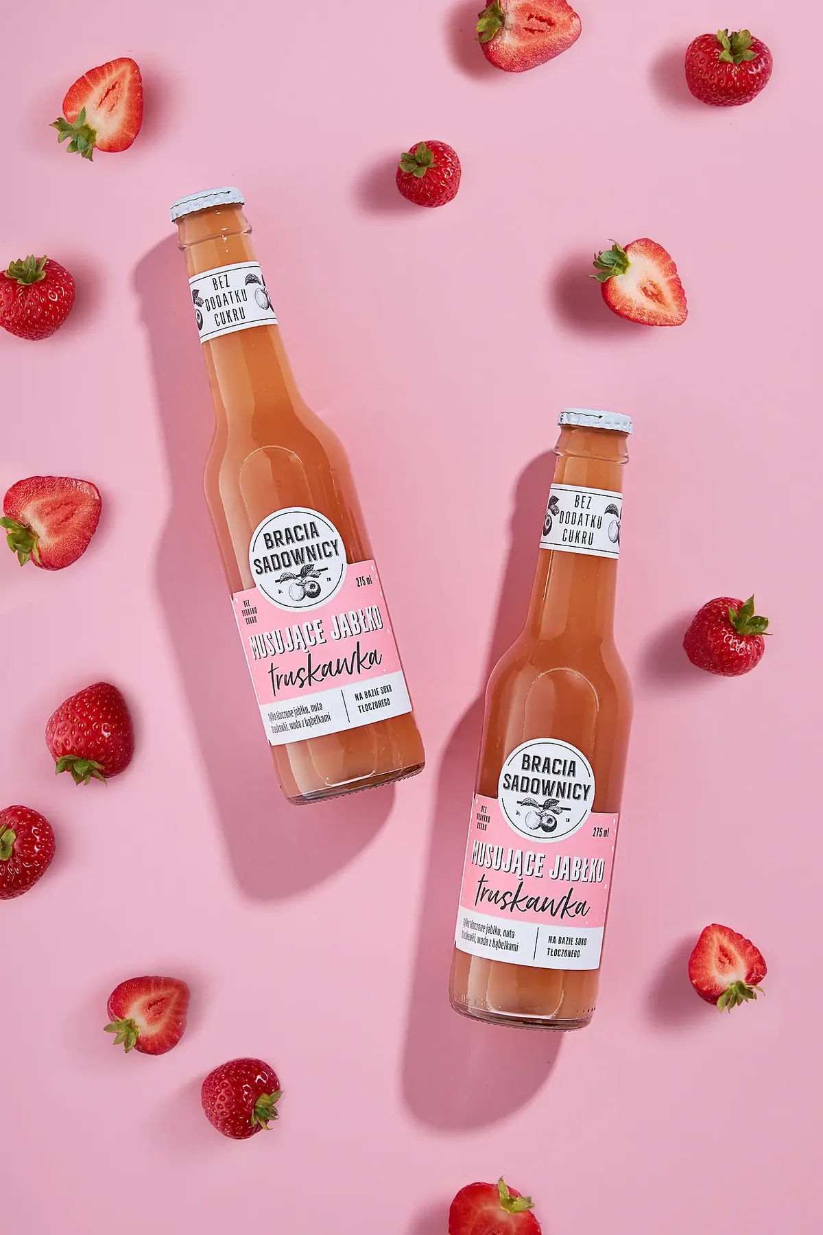

- Light: hard, from the side. The shadows of the bottles add depth.
- Prop: the strawberries show the flavour.
- Background: pink like the drink, so the whole frame feels of a piece.
Advertising shot from aboveWhere to use it: Instagram, ads
Create a shoot like thisIn short
- A typical product page in the stores we checked has 4 photos. One in seven has just one.
- In food and supplements, more than half of the pages have one photo. In clothing there are usually 6.
- 2 in 3 pages open with a photo on white. In jewellery almost all of them, in clothing one in four.
- Only 5 in 100 pages show the size of the product, and the same share show the packaging. This is the easiest place to stand out.
Our study: 1,396 product pages from 44 Polish brand online stores, 8 industries, November 2026 (photo types: 204 pages reviewed one by one). Marketplaces not included. Read the numbers as a benchmark of brand stores, not as rules for the UK. How we counted
01 Cosmetics
Cosmetics: the colour has to match what arrives in the parcel.
In the brand stores we checked, cosmetics pages usually have 6 photos per product. Yet a close-up of a cream or lipstick appears on only 2 of 24 pages.
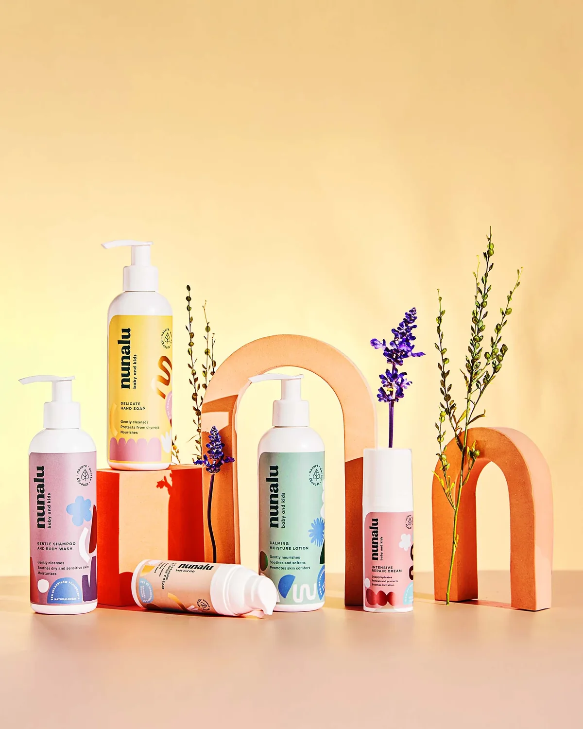

- Plinths: arches and blocks split the range into groups and put the bottles at different heights.
- Sage: the sprigs hint at natural ingredients and do not cover the product names.
- Background: warm yellow and pink, in the colours of the labels, so the range looks consistent.
Styled scene on a coloured backgroundWhere to use it: Instagram, collection banner, store home page
Create a shoot like this3 tips
- Main image: the product alone on white, label facing the camera.
- Add a texture shot: cream spread on glass, up close.
- Do not push the colour in editing. A lipstick shade that differs from the one in the parcel is the quickest route to a return.
What Polish brand stores in this industry show
- On white18 of 24 pages
- With text on the image14 of 24 pages
- Styled scene11 of 24 pages
- On a model8 of 24 pages
- Group shot3 of 24 pages
02 Jewellery
Jewellery: what sells is the detail you see up close.
In the brand stores we checked, almost every jewellery page opens with a photo on white. Very few show how big a ring or an earring actually is.
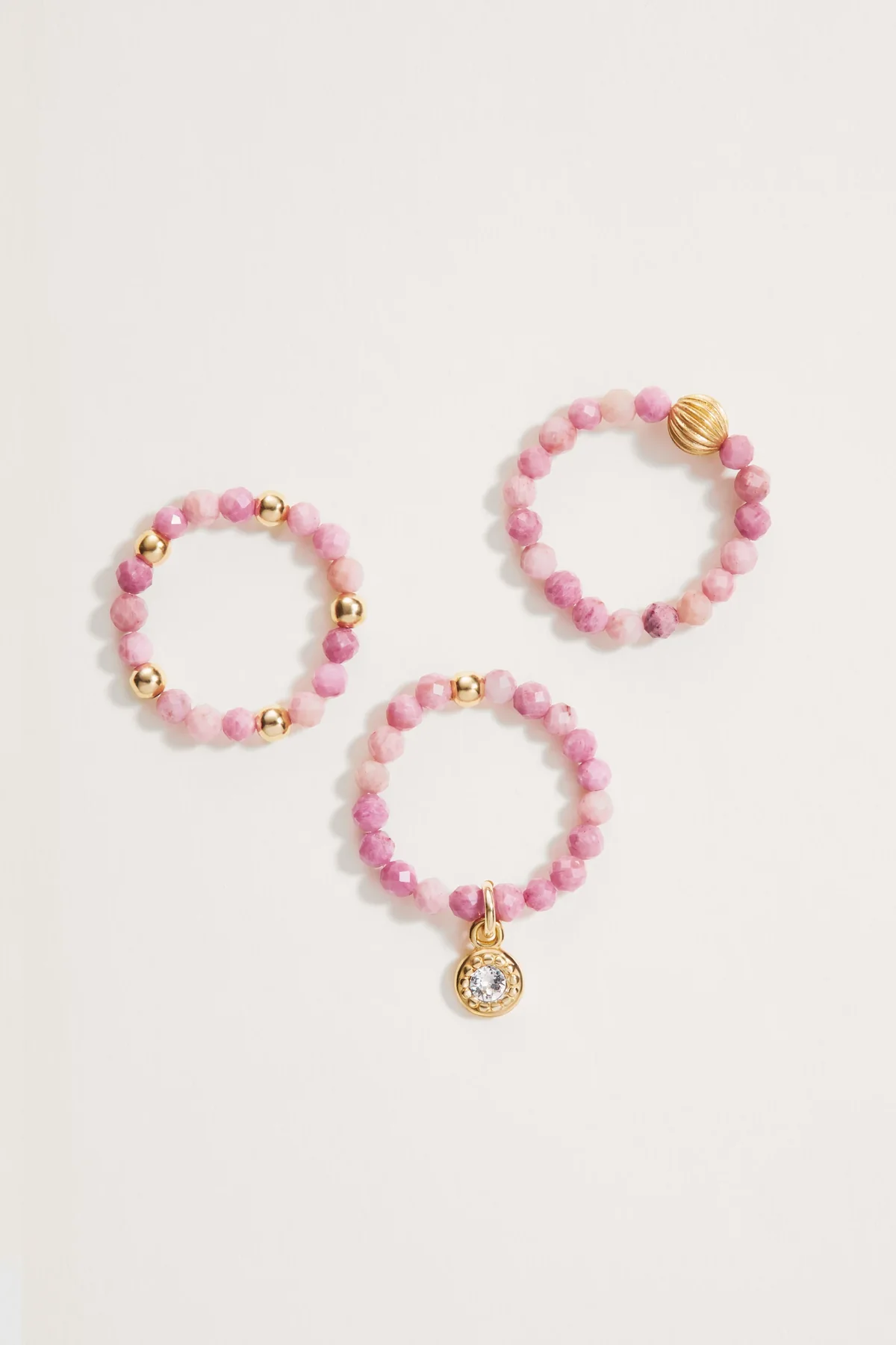

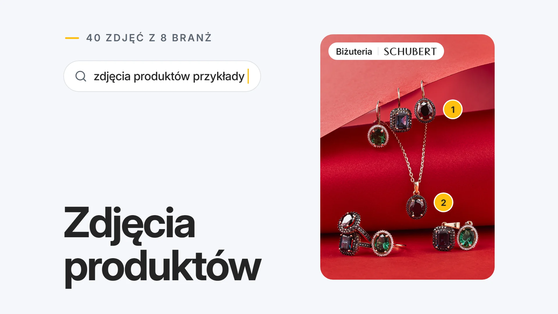
- Set: three rings from one set arranged in a triangle, so it is obvious at once that they belong together.
- Charm: the 3 mm cubic zirconia in the charm is as sharp as the rhodonite next to it.
- Background: light and warm, so the pink of the rhodonite looks true to life.
Group shot on a light backgroundWhere to use it: online store, product page, sets
Create a shoot like this3 tips
- The whole stone has to be sharp. Up close only a thin slice comes out sharp, even with a good camera. Take several shots with the focus moving from front to back and merge them into one in software (focus stacking).
- Show the size: earrings next to an object everyone knows.
- Take one photo with a grey card (a card for setting colour, sold in photo shops) next to the jewellery and correct the colour of every photo from it. Without it, gold comes out greenish and silver yellowish.
What Polish brand stores in this industry show
- On white21 of 24 pages
- On a model14 of 24 pages
- Close-up6 of 24 pages
- In the box5 of 24 pages
- Scale4 of 24 pages
03 Clothing
Clothing: buyers want to see the cut and the fabric.
In the brand stores we checked, clothing pages usually have 6 photos per product, most often on a model. Without a model, clothes are shot on a ghost mannequin or as a flat lay.
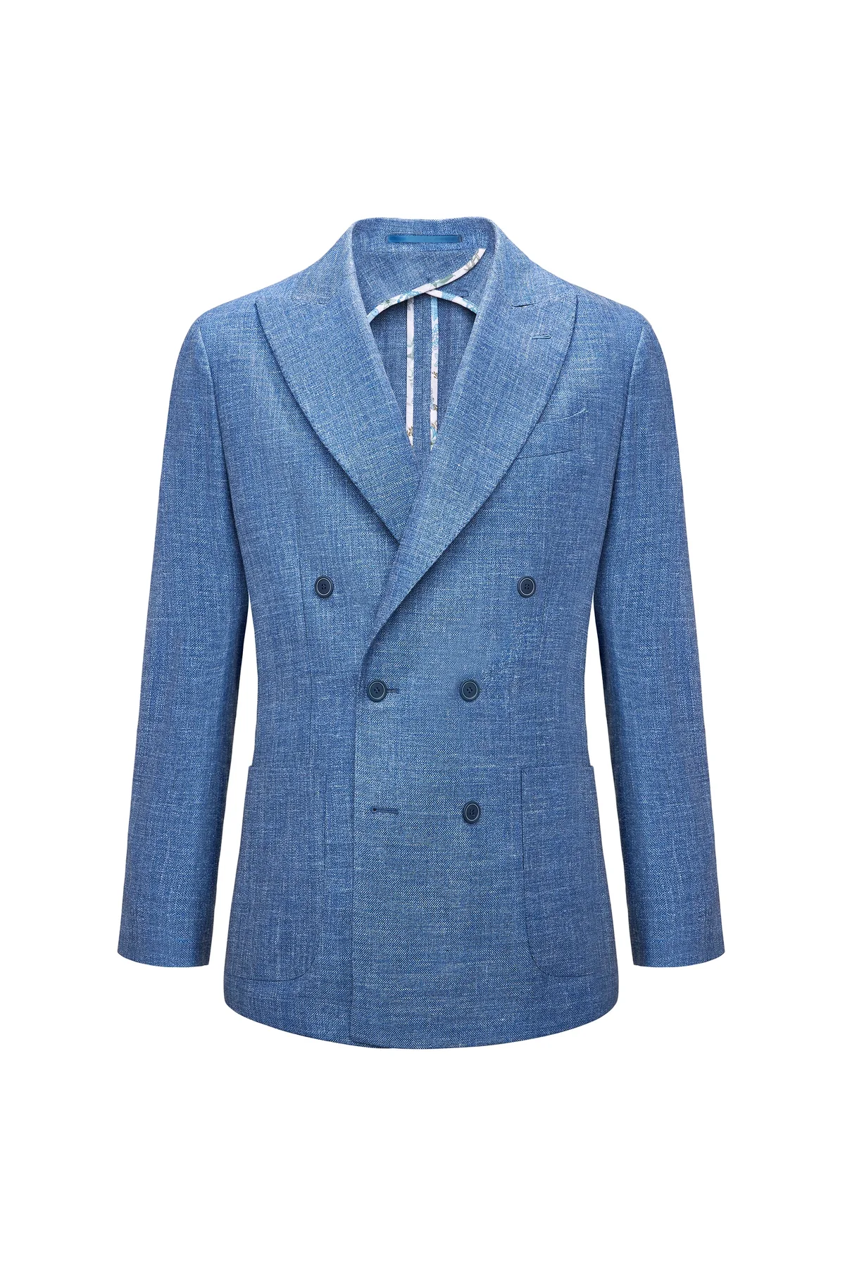

- Mannequin: you cannot see it, yet the blazer keeps its shape; at the back of the neck you see inside the collar.
- Fabric: soft light from the front shows the weave of the cloth along its whole length.
- Background: pure white, so this photo can open the product gallery.
On a ghost mannequinWhere to use it: main image, own store, product page
Create a shoot like this3 tips
- Steam the garment before the shoot. Creases make the fabric look cheap.
- Shoot the front, the back and a close-up of the fabric. The close-up stands in for touch.
- Shoot every colour separately. A colour changed in editing almost never looks real.
What Polish brand stores in this industry show
- On a model18 of 24 pages
- Other plain background11 of 24 pages
- On white6 of 24 pages
- Close-up5 of 24 pages
04 Shoes
Shoes: which way the toe points depends on where you sell.
Amazon's shoe style guide (2019) shows the main image with the toe pointing left. In the brand stores we checked, only 1 of 25 shoe pages has a styled scene.
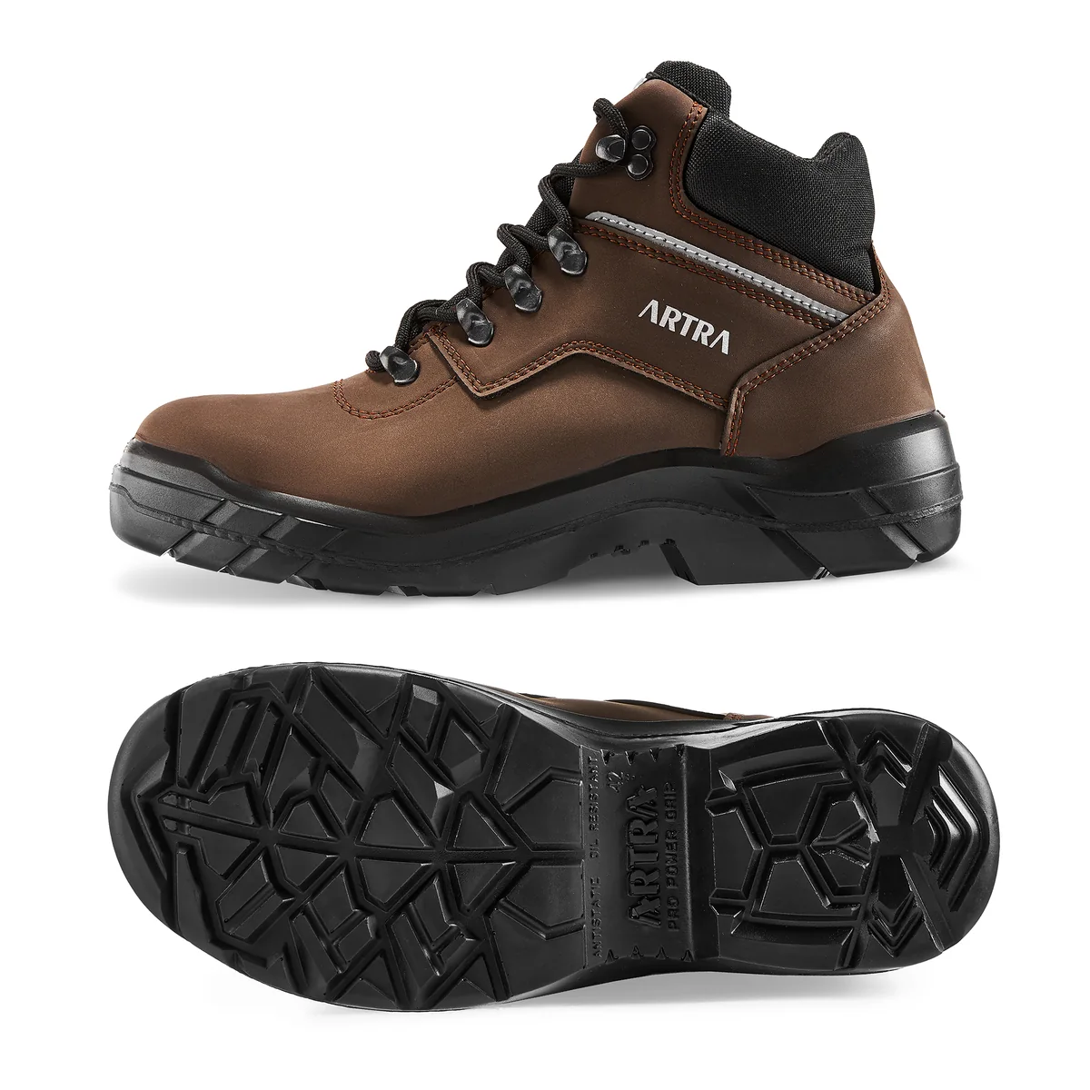

- Direction: toe to the left, as in Amazon's 2019 shoe guide. The sole view next to it makes this a strong second photo in the gallery.
- Sole: the whole tread is visible, from heel to toe.
- Material: soft light shows the texture of the upper and the grey strip on the side.
On white, two viewsWhere to use it: product page
Create a shoot like this3 tips
- For Amazon's main image: one shoe, toe to the left, slightly angled, no box (2019 guide, so check the current one in Seller Central).
- Stuff the shoe with tissue paper and lace it evenly. Otherwise the upper collapses.
- Add a photo of the sole. For sports and kids' shoes it is the first thing buyers ask about.
What Polish brand stores in this industry show
- On white18 of 25 pages
- Other plain background7 of 25 pages
- Close-up6 of 25 pages
- Styled scene1 of 25 pages
- On foot1 of 25 pages

05 Home & decor
Home & decor: buyers have to picture the item in their own home.
In Baymard Institute research on online shopping, almost 8 in 10 people buying furniture and home decor started by looking at the photos. In a photo of a mug or a candle you cannot tell how big it is until it stands next to other things.
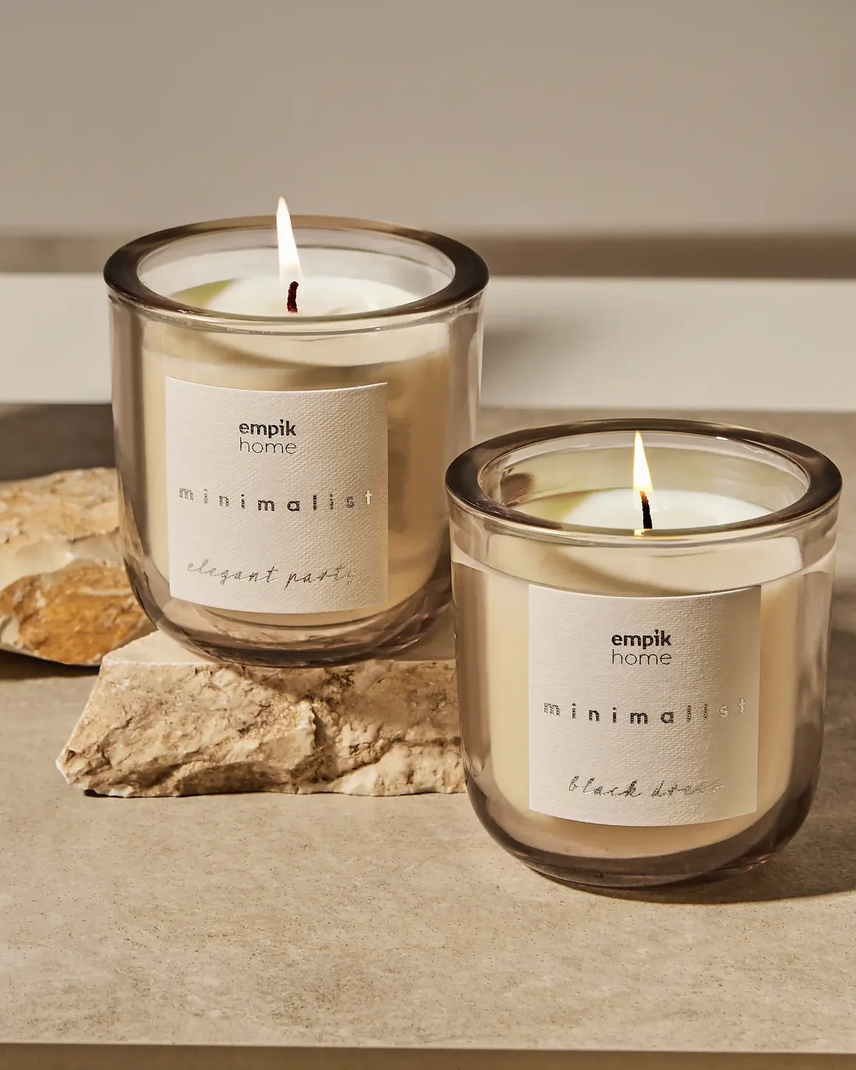

- Flame: both candles are lit, so you can see how they look in the evening.
- Label: the candles face the camera and the name of the line is readable.
- Stone: raw stone and warm side light set a calm mood without extra props.
With natural props, candles litWhere to use it: Instagram, collection banner, product page
Create a shoot like this3 tips
- Show the size: the product in a room or next to something everyone knows.
- Add a photo with dimensions. Put the numbers on a gallery image: Amazon's main image has to stay free of text.
- Show a candle lit. The flame and the wax are shot separately and combined, otherwise the flame comes out as a white blob.
What Polish brand stores in this industry show
- On white15 of 25 pages
- Styled scene10 of 25 pages
- Close-up7 of 25 pages
- Other plain background6 of 25 pages
- With text on the image5 of 25 pages
06 Food & supplements
Food & supplements: a readable label comes first.
In the brand stores we checked, more than half of the food and supplement pages have just one photo. Yet buyers want to read the ingredients before they buy.
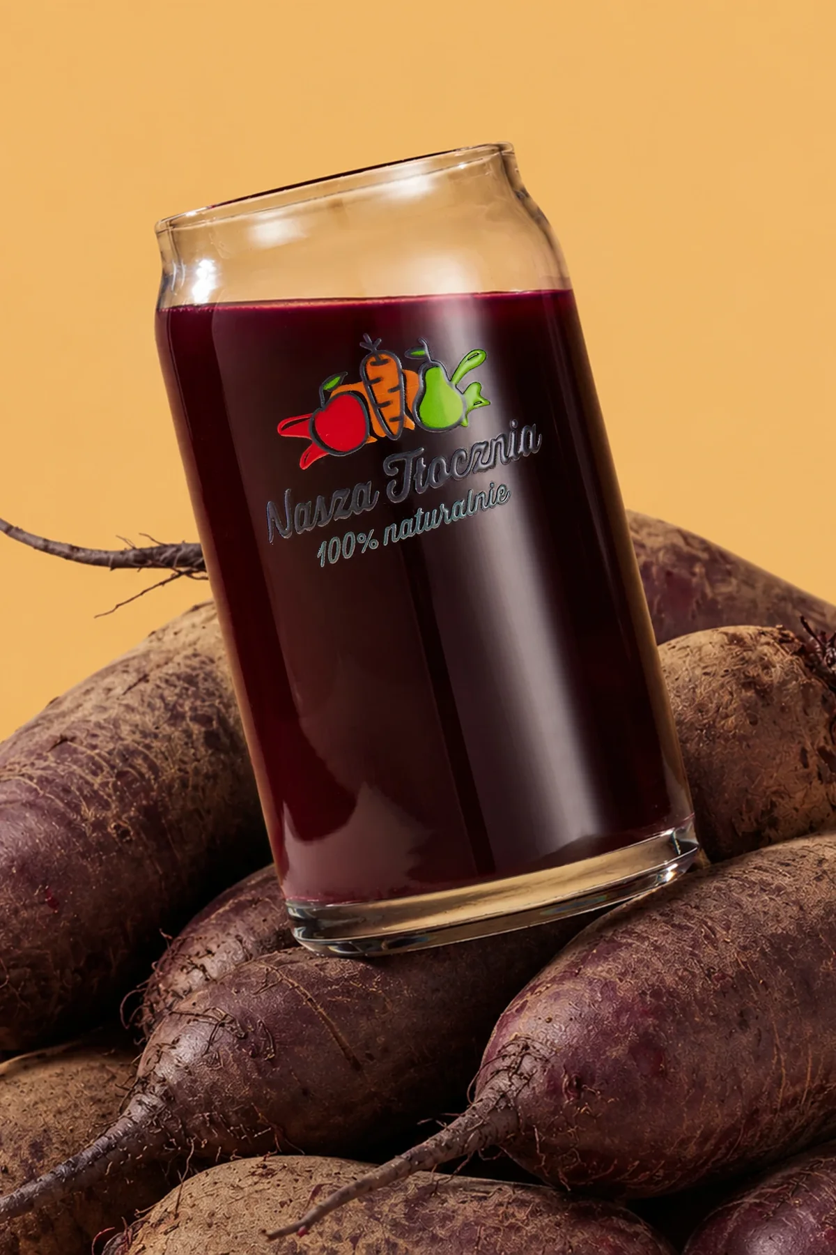

- Logo: the glass is turned slightly sideways, yet the logo is still readable.
- Prop: the beetroots under the glass show what the juice is made from.
- Background: orange, a strong contrast to the deep red juice.
On a coloured background, with propsWhere to use it: Instagram, ads, online store
Create a shoot like this3 tips
- Main image: the pack facing front on white, with readable text.
- Add a photo of the back of the pack with the ingredients. Type the ingredients and allergens into the description too: food law (EU FIC and its UK version) requires this information before purchase, and a photo can be hard to read.
- A plated dish only as a later photo. On the first one, buyers should see what they will actually get.
What Polish brand stores in this industry show
- On white15 of 25 pages
- Group shot7 of 25 pages
- Styled scene7 of 25 pages
- Top-down2 of 25 pages
- Close-up1 of 25 pages
07 Sport
Sport: show up close what people pay for.
In the brand stores we checked, sports pages show close-ups more often than any other industry: 14 of 32 pages. Material, tread and fastenings decide the price.
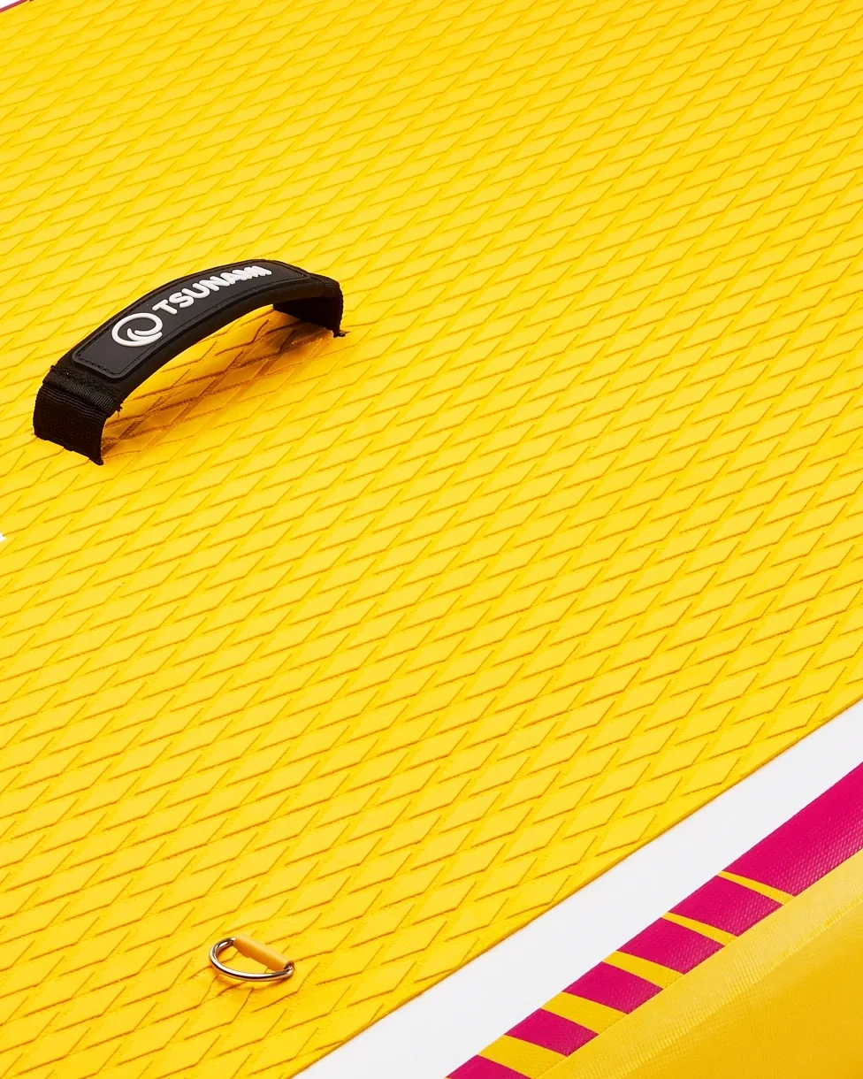

- Handle: it sits close to the lens, so you see straight away how the board is carried.
- Foam: side light brings out the grooves of the non-slip foam.
- Rail: the coloured stripes show the board's pattern without a full shot.
Close-upWhere to use it: product page, after the photo of the whole board
Create a shoot like this3 tips
- Take a close-up of the material: mesh, membrane, tread.
- Show fastenings and adjustment. For gloves and helmets that answers the question about size.
- Show black gear on light grey in the gallery. On black the shape disappears in a small thumbnail, and Amazon's main image needs pure white anyway.
What Polish brand stores in this industry show
- On a model21 of 32 pages
- On white20 of 32 pages
- Close-up14 of 32 pages
- Other plain background3 of 32 pages
- With text on the image2 of 32 pages
08 Kids
Kids: the whole set and the age range visible at once.
Parents want to know exactly what is in the box and what age the product is for. The photos do not need a child: the product shown from every side is enough.
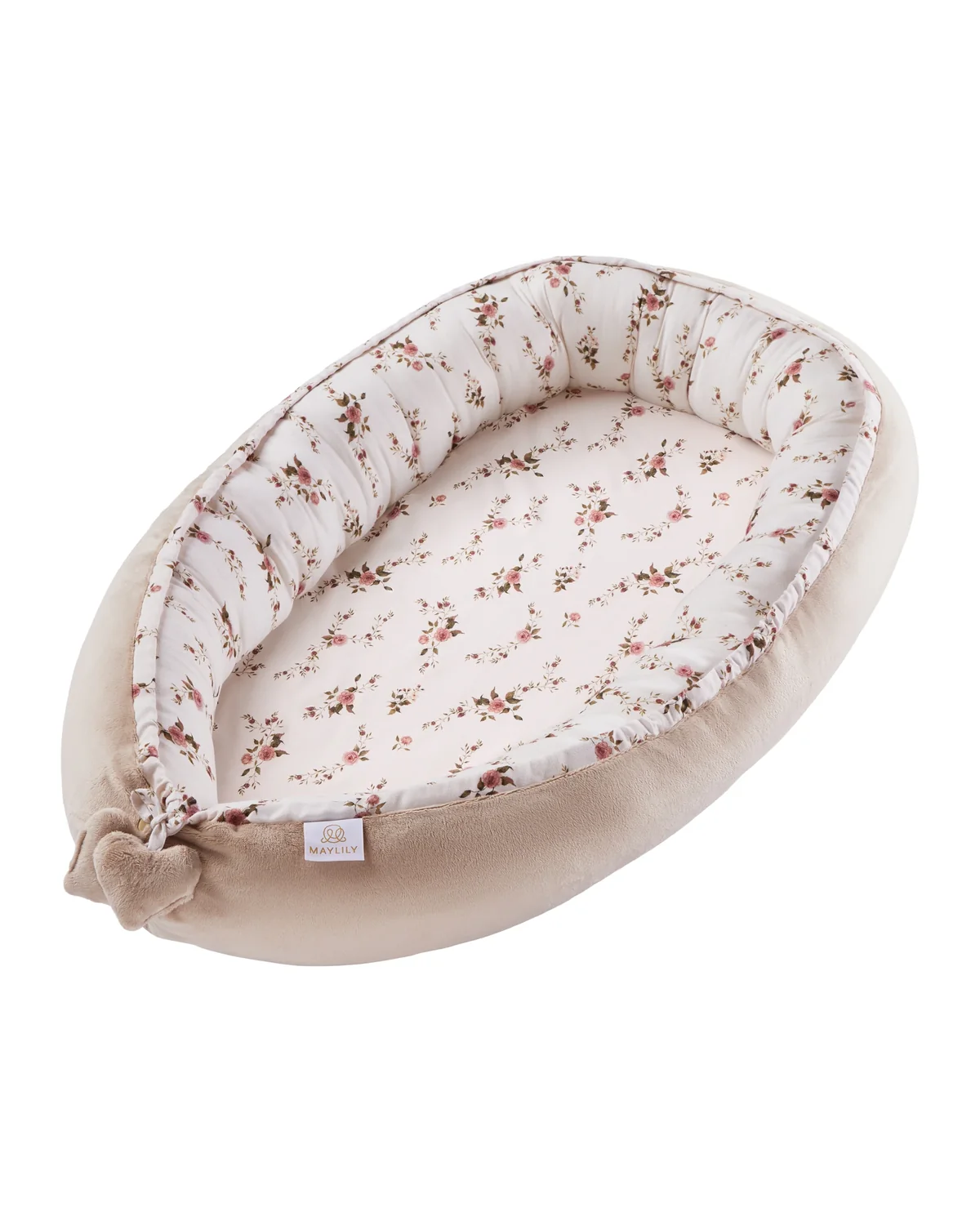

- Inside: the angled view shows how deep the nest is.
- Edges: the soft bumper around it is visible along its whole length.
- Background: white, so this photo can go first in the gallery.
On white, at an angleWhere to use it: main image, Amazon, own store
Create a shoot like this3 tips
- First photo: the whole set, every piece together.
- With toys, age warnings have to be visible before purchase: show them in the photo of the packaging and type them into the description.
- Show the product in a child's room, with no child in the photo. Then you can see how big it is.
What Polish brand stores in this industry show
- On white17 of 25 pages
- On a model11 of 25 pages
- Styled scene10 of 25 pages
- Group shot5 of 25 pages
- In the box4 of 25 pages
Tool
Shot list for your industry. Six shots worth having.
1. Industry
2. Where you sell
3. Tick the shots you want. The PDF saves the ticked ones, or the whole list if you tick none.
Cosmetics · Amazon
Main image on pure white, the product filling about 85% of the frame, with no text, logos or extra items. At least 1,000 px on the longer side so shoppers can zoom in. Selling on eBay too: 500 px minimum, up to 24 photos, white recommended.
- Front on whitemain image, the product alone, with the carton only if that is how you ship it18 of 24 pages have it
- Back with the labelingredients, volume and warnings readable when zoomed in
- Product openpump, dropper or applicator
- Close-up: texture or shadecream spread on glass, side light2 of 24 pages have it
- Variants side by sidesizes or shades in the same light3 of 24 pages have it
- Styled scenestone, water, bathroom: the brand's mood11 of 24 pages have it
"18 of 24 pages have it": how many of the product pages we reviewed in our November 2026 study of Polish brand stores include this shot. Channel rules, checked on 18 November 2026: Amazon from a Seller Labs summary (August 2025) and Amazon style guides from 2019-2022, Etsy and Shopify from their help centres, eBay from its help pages.
Gallery
40 product photos. Open one to see what works.
Method
Where the numbers come from. 1,396 pages, 44 stores, 8 industries.
In November 2026 we counted the photos on 1,396 product pages from the online stores of 44 Polish brands, between 120 and 240 pages in each of the 8 industries. Marketplaces were not included. Some pages (604) we reviewed in saved copies from 2025-2026.
A script checked the background of the main image from the colour of the photo's edges. Photo types were reviewed by one person, on 24-32 pages per industry, which is why we give counts such as "18 of 24 pages" rather than percentages. Large stores have more pages in the full sample (up to 40), so the numbers describe the pages we reviewed, not every online store in Poland, and they are not a picture of the UK market. We do not name the stores. For marketplace main images we have separate data, including Kaufland.de, in our main image study.
Frequently asked questions
How many photos should a product listing have?
In the brand stores we checked, a typical product page has 4 photos, and 6 in clothing and cosmetics. Six is enough to show the front, the back or other side, the material up close, the size, the label or contents and the product in use. Marketplaces allow more: Amazon up to 9 images (7 visible on desktop), eBay up to 24. The six-shot list for your industry is above.
What are the main types of product photography?
On white (the main image, or packshot), close-up or detail shot, group shot (colours, sets), flat lay from above, styled shot with props or in a scene, scale shot, photo with text on the image and advertising shot for banners. Plus photos on a model, which this article does not cover.
What types of product photos sell the most?
There is no hard data that one type sells best for every product, and we have no sales figures for the pages in our study. What the study does show is the gaps: only 5 in 100 pages show the size of the product, and 5 in 100 the packaging. A photo that answers a common buyer question (size, material, what is in the box) is a safer bet than one more styled shot.
What background is best for product photos?
For Amazon's main image, always pure white. In your own store, Shopify included, the choice is yours, but keep one background across the collection; light grey works well for fashion. Coloured backgrounds and styled scenes work further down the gallery, on Instagram and in ads.
Can you take product photos with a phone?
For Instagram, often yes. For the product page it is harder: with small items a phone gets only a slice of the product sharp, and without a grey card the colour comes out different from real life. Buyers spot both mistakes as soon as they zoom in.
What colours don't photograph well?
Black on black and white on white are the hardest: the edge of the product disappears, especially in a small thumbnail. Clear glass and plastic vanish on white, and gold and silver shift colour without a grey card. In the gallery above, the white work shoe on white keeps a clear edge and the clear water bottle has a dark outline. Black gear is easier to read on light grey.
How do I order photos like these from marszalstudio?
Next to the large photos and in the enlarged gallery view there is a "Create a shoot like this" button. It opens our app with that type of photos already selected. You send us the products and follow the shoot online through a personal link.
Services
Photos for your industry. Pick one and create a shoot.
Not every industry has its own page in English, so each card leads to the service that fits it best. You create the shoot in the app: choose the type of photos, the background and the number of shots.